Heartland Kids
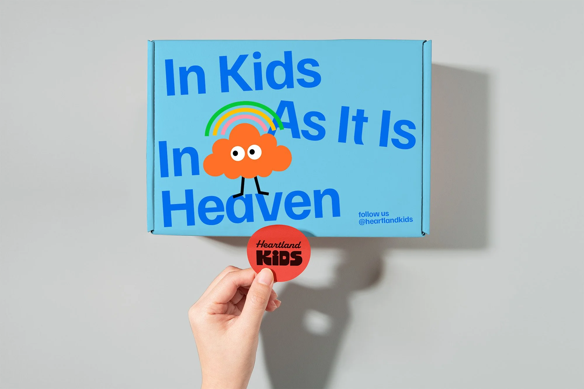
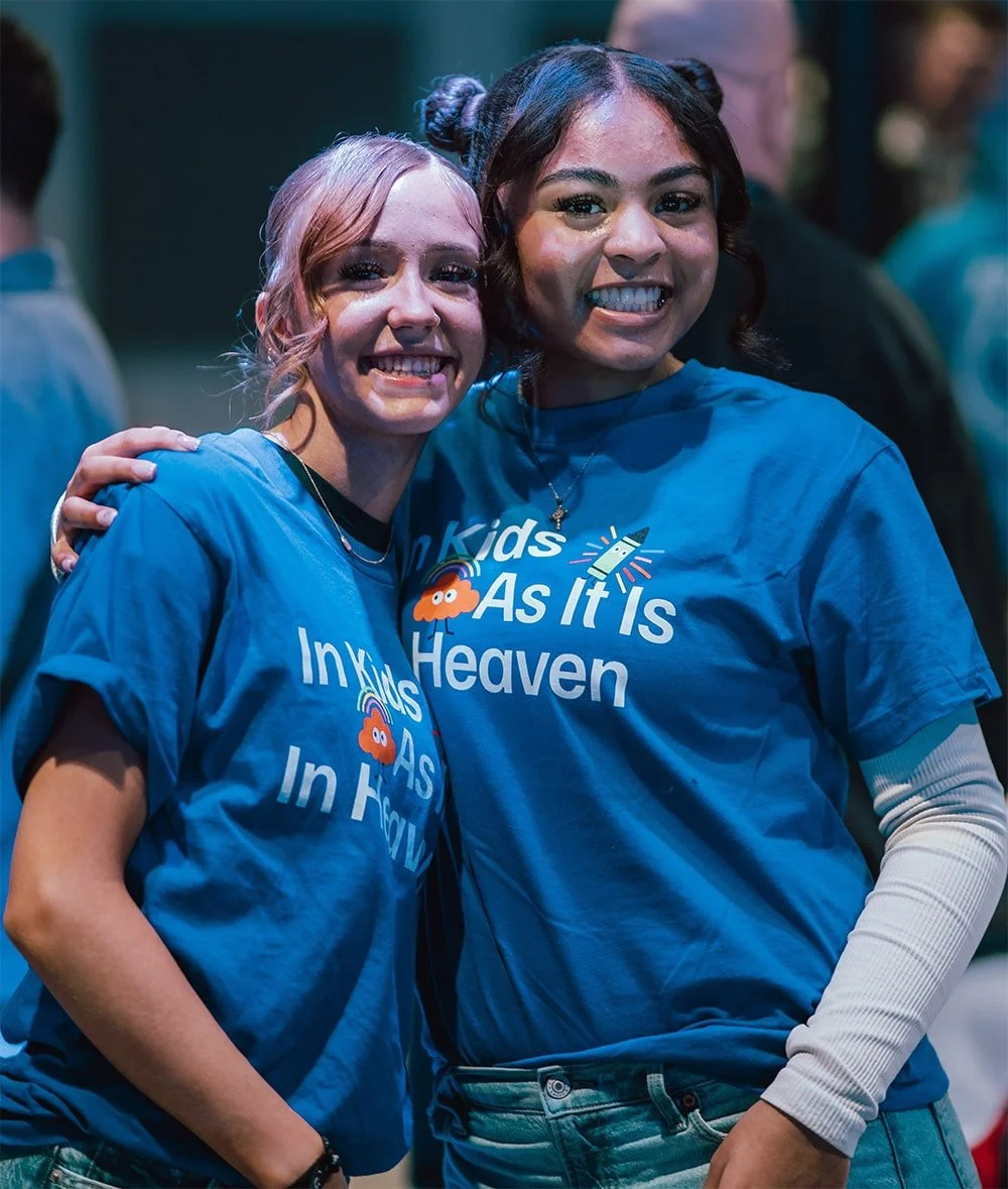
Heartland Kids was built around a single conviction: church should be the most exciting hour of a child's week. Its guiding phrase, "In Kids As It Is In Heaven," runs through every classroom and every interaction, shaping a ministry where kids are known by name and discipled from the ground up.
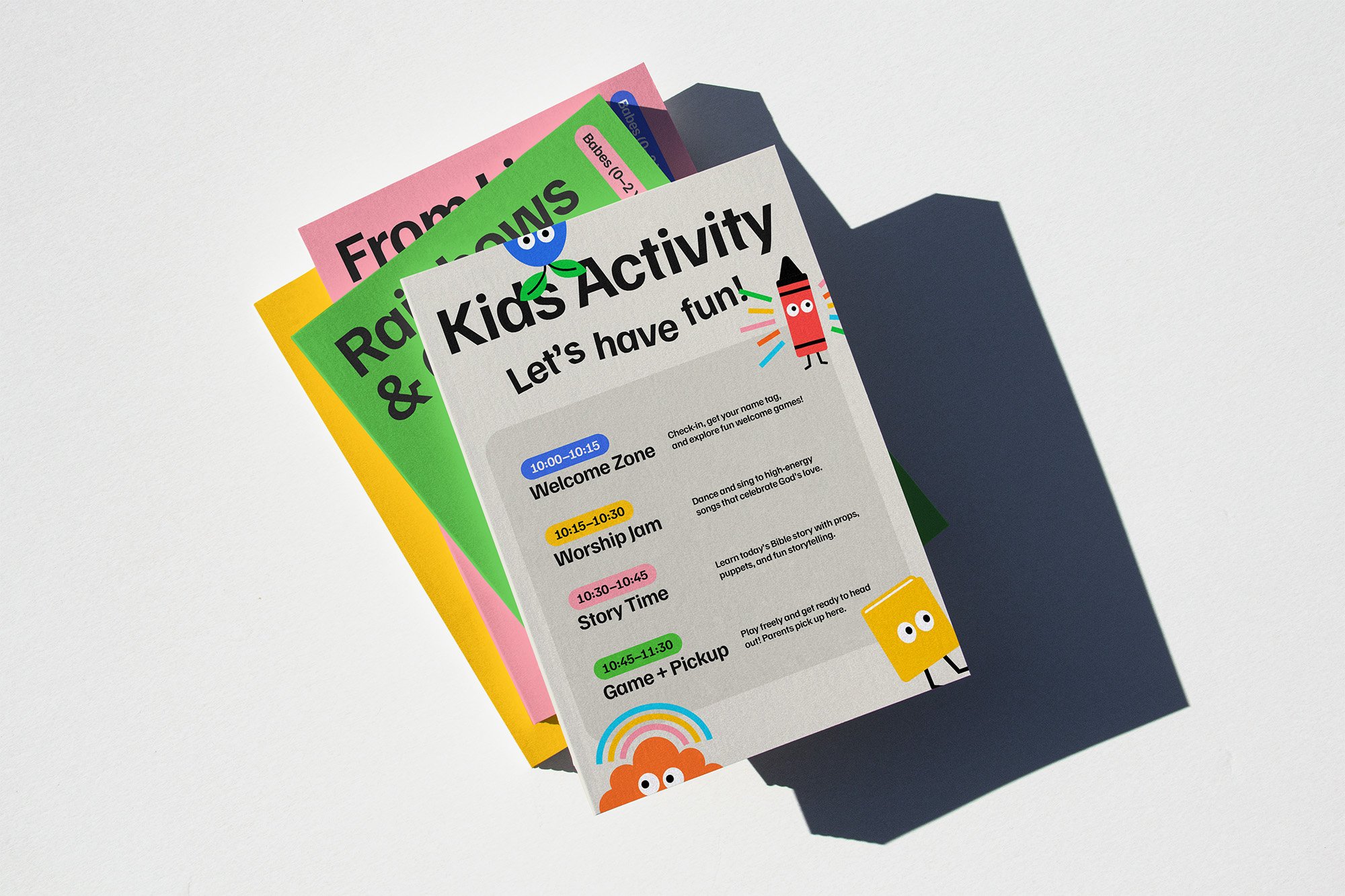
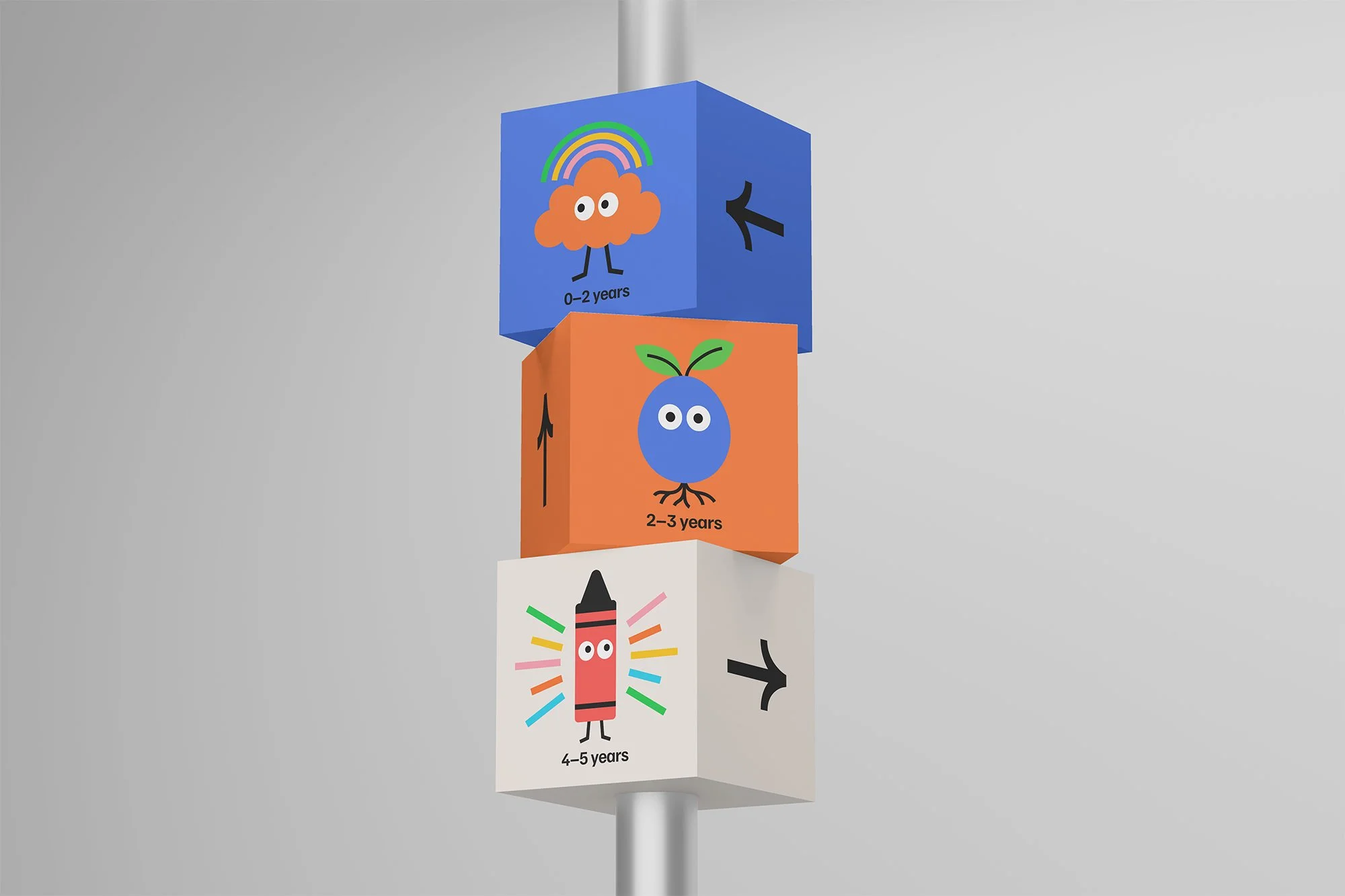
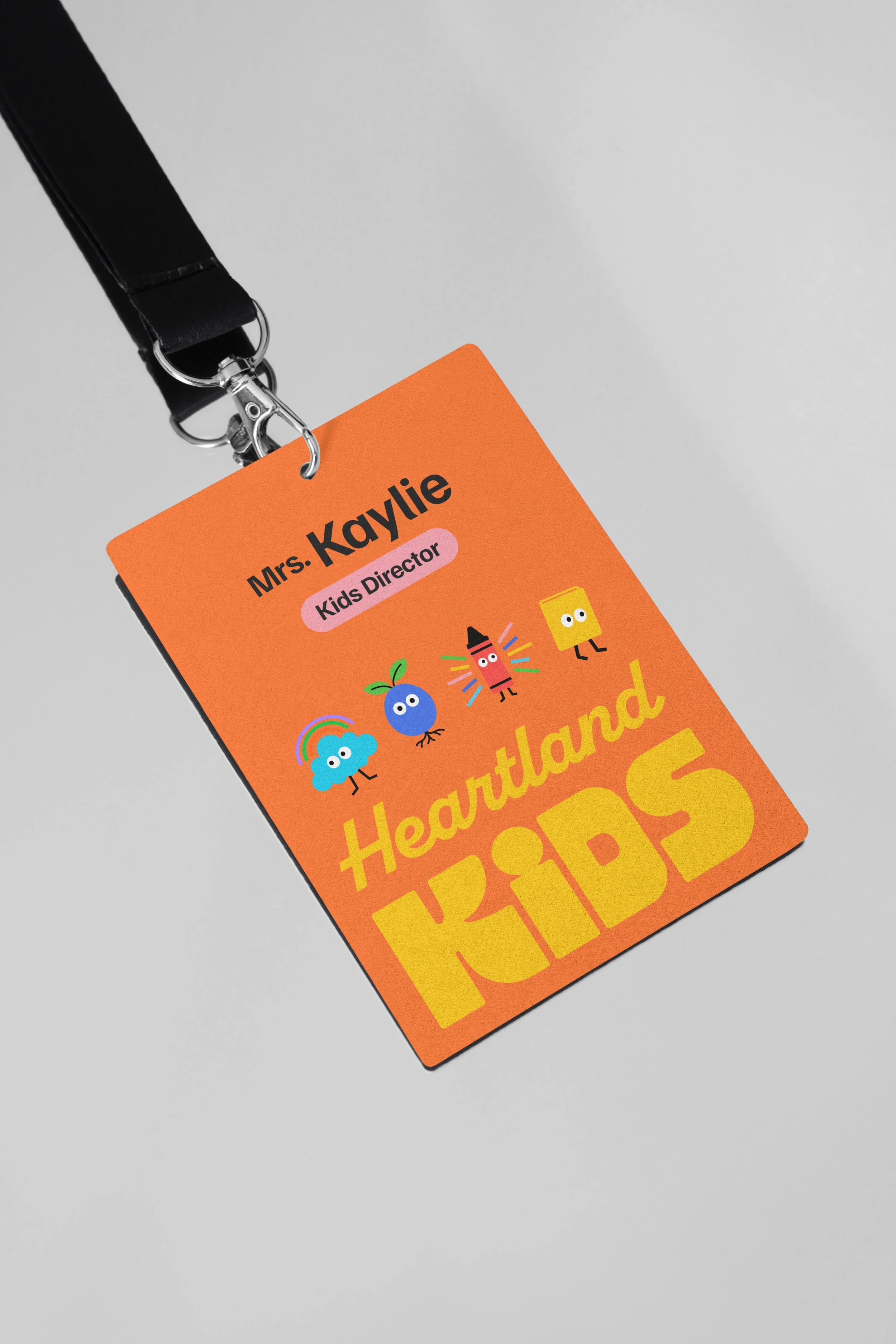
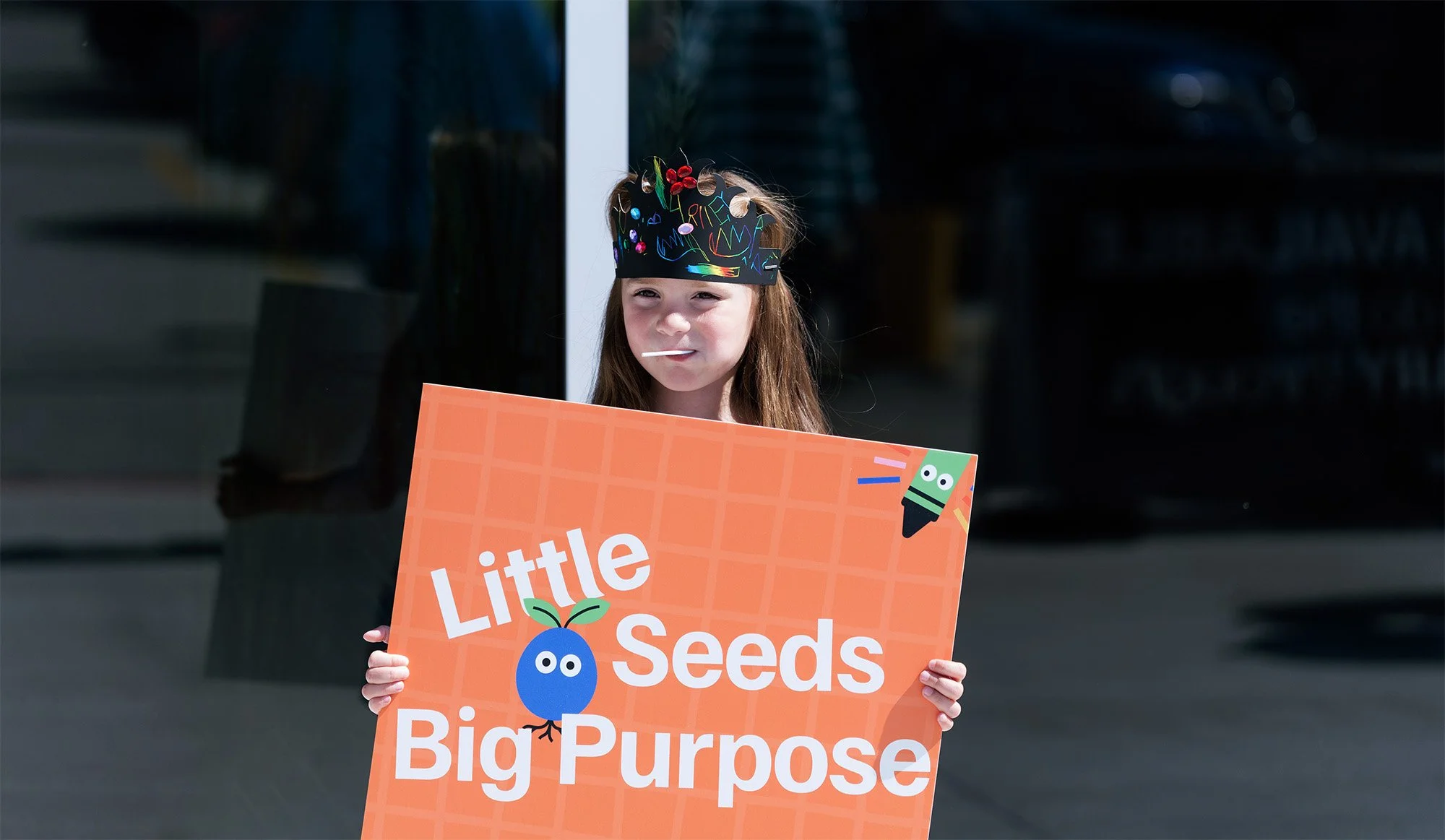
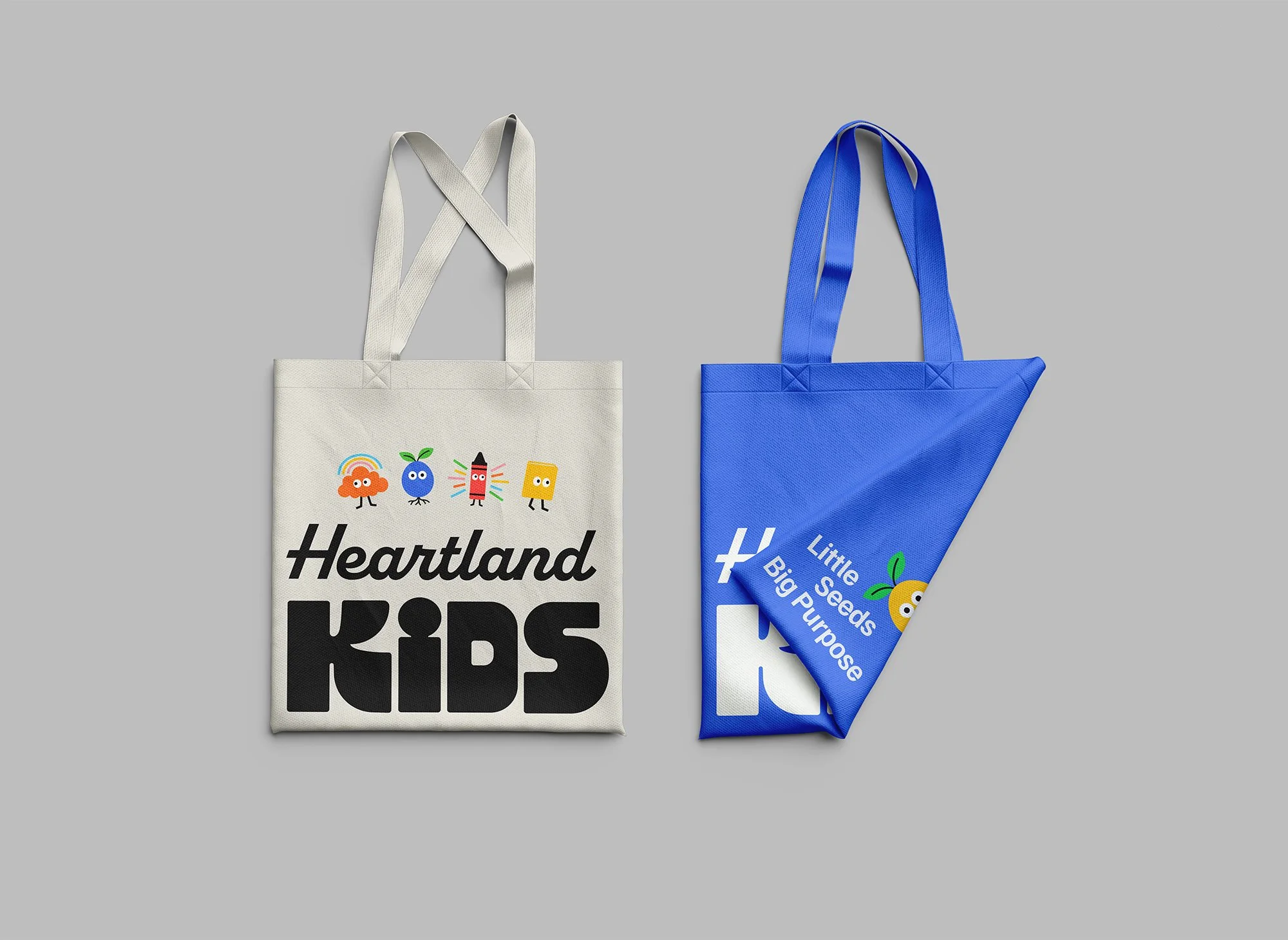
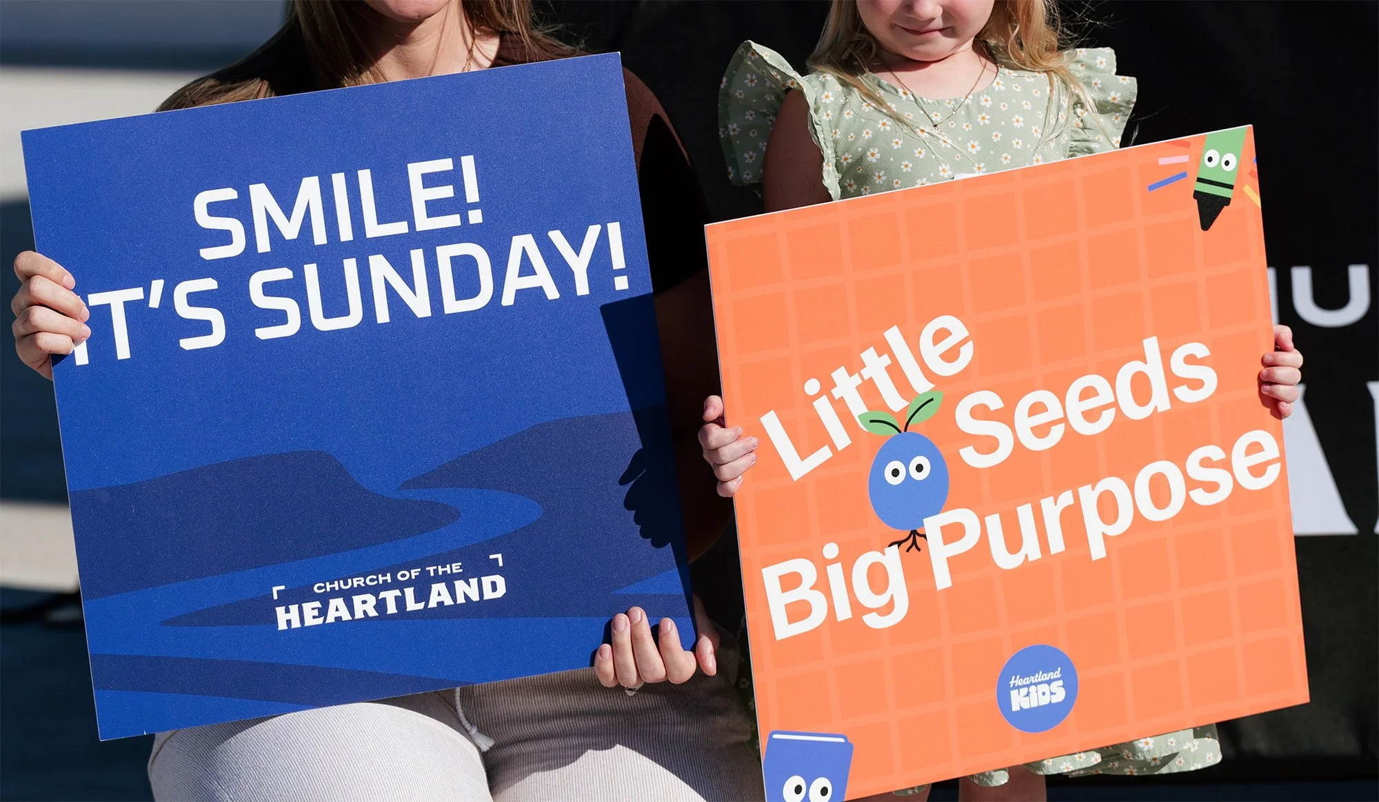
The visual identity carries that warmth into form. Soft, playful, and consistent across each age group, from Babes to Bigs, it builds a sense of trust that grows with the child. Clear typography and a gentle color language keep every touchpoint approachable for parents while still feeling alive and welcoming for kids.
The result is a visual system that parents recognize as safe and kids recognize as theirs, making Heartland Kids feel less like a program and more like a second home.
Client: Church of the Heartland
Services: Brand Identity, Visual Systems, Signage, Collaterals
Industry: Faith & Nonprofit
Team: Josh Villa & Rodrigo Kugnharski
Custom Characters

Rainbows & Clouds
Babes (0–2 Years)

From Little Seeds Grow Mighty Trees
Tots (2–3 Years)

The Wonder of Color
Littles (4–5 Years)

Made for More
Bigs (K–5th Grade)